Ducray
Less is More
Branding | Packaging
This project was also listed and featured on the EPDA DIY Package Design Award in the Student Category for 2015.
Official listing at: http://www.epda-packaging.com/_downloads_upload/epda_DIY_Entries_Students.pdf
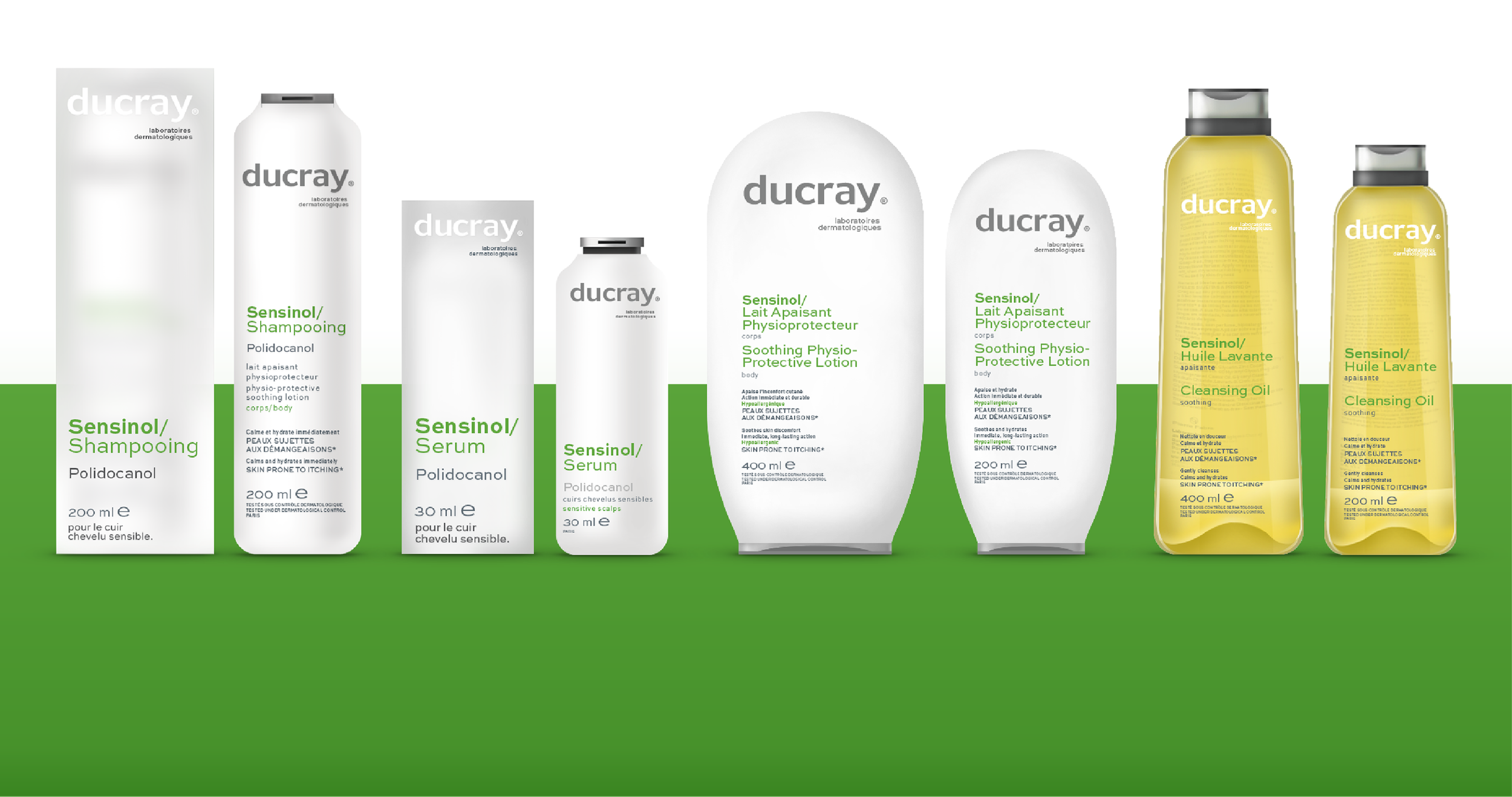
Identity redesign and packaging redesign for Ducray. Ducray is a reputed pharmaceutical company situated in France. The main goal of the assignment was to create a distinguishable wordmark with a high visual impact and to create a package design format that expresses scientific research without being overbearing.

The Insight
Ducray creates the highest quality Derma Cosmetic products that are prescribed by dermatologists all over the world. The company has a long history of research and partnerships with health professionals.
The Challenge
To create a distinguishable wordmark that has high visual impact and to create a package design format that expresses scientific research without being overbearing.
The Solution
With the Ducray rebranding and package design we will deal with 3 major areas of interest: Making Ducray; Synergetic, Modern & Memorable.
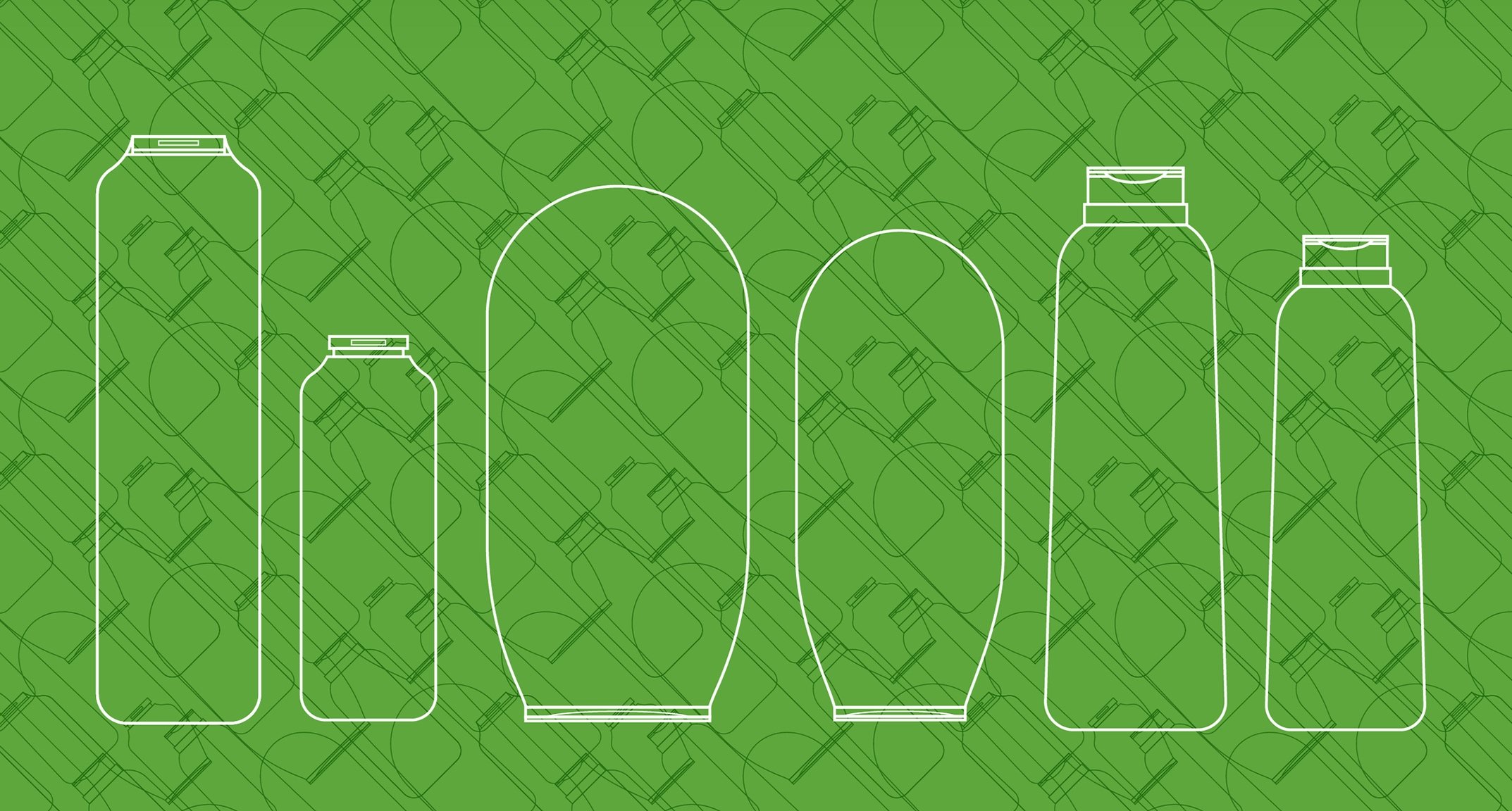
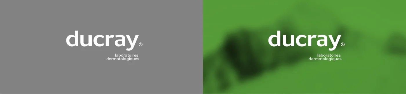
The new design strategy enforces precision and improves legibility. We bring about a basic design strategy that will guarantee shelf visibility and product indication. We choose to keep the same colour palette to reduce logistical changes on a global scale but plan to tweak the colours to create visual harmony.